LIVINGROOM COLORS
The colour we choose to paint our livingroom is very important. Each colour has its importance because it transmits different sensations and emotions. When choosing colours we should take into account several aspects, for example, the pre-existent furniture and textures so it is easier to combine them all in the best way.
Next, we will show you wich colours to use for wall decoration in 2018, according to the latest design trends.
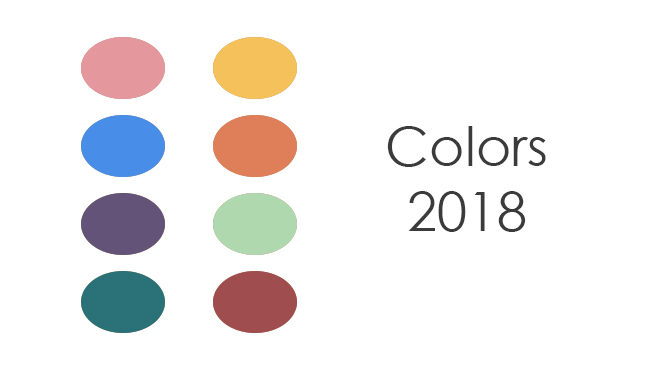
Trendy wall colours for 2018
Colour is everywhere and its presence is something that draws our attention. The return to the use of colour comes along with the “back to the 80s” decorative trend.
Primary colours such as red, yellow and blue, and the warm and earthly tones as orange and Bordeaux, not forgetting the green which always comes associated with the tropical-natural theme.
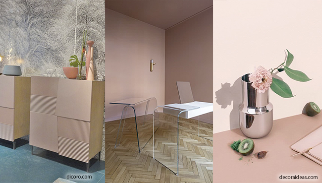
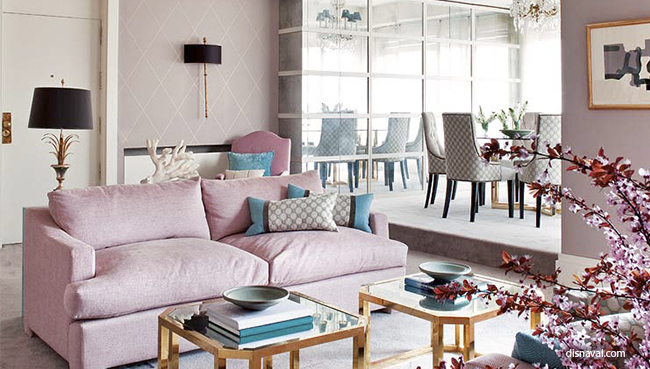
Flamingo Pink
A subtle and delicate colour that gives us a sense of tranquillity with its soft tone, we can also include here the pastel pink and soft lilac.
Pink can be seen not only in walls but also in objects and furniture pieces.
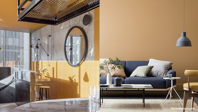
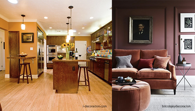
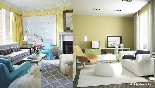
Mustard and Safran Yellow
It is a colour that illuminates our livingroom giving it a welcoming look that will match perfectly with different Styles, such as the industrial look or even a Nordic one, as you can see in the following images.
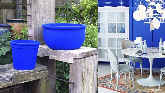
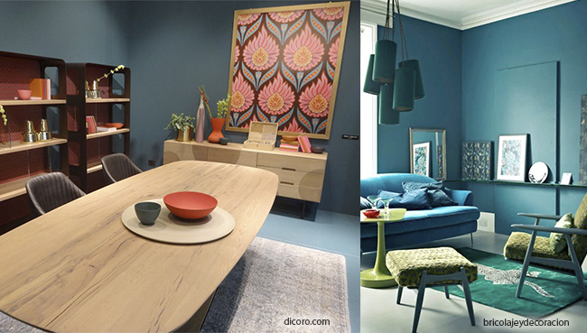
Klein blue
Intense colours, like the Klein blue, take us back to the avantgarde era, modernism and optimism of the 60’s. As it is a very powerful colour, we will combine it with softer tones like whites or pastels, that you can find either in walls or in decorative accessories. One makes up for the other’s intensity.
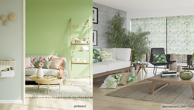
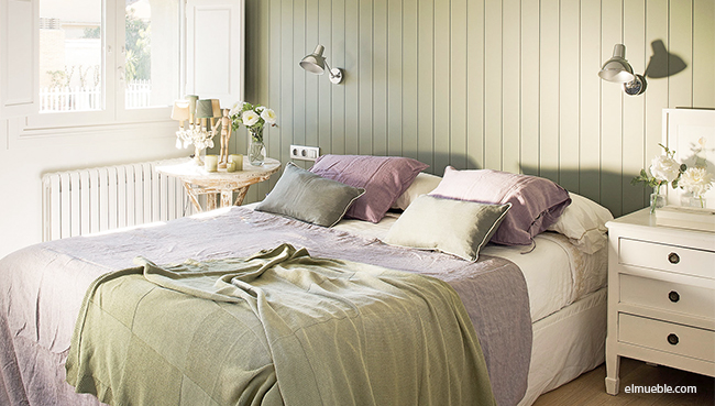
Tropical-Natural Green
Greenery, this is how we can define this palette since it is composed of nature inspired tones. This colours symbolize the healthyness and calmness.
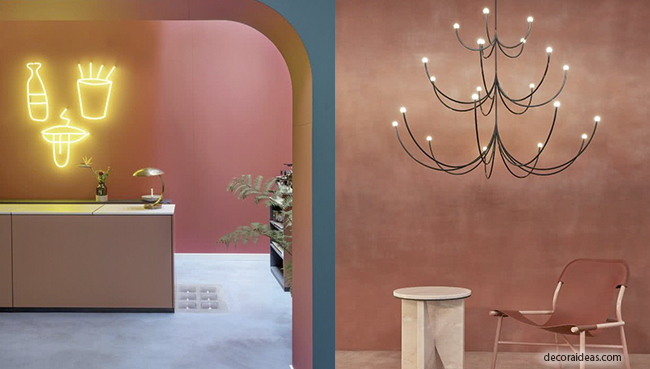
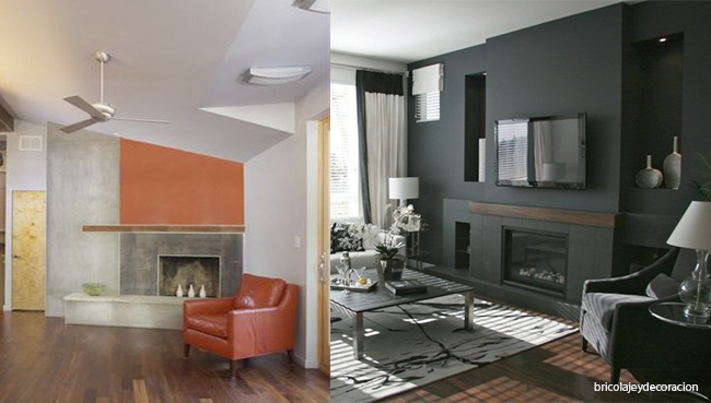
Orange and Bordeaux
Earthly tones, from oranges to reddish browns.
Colours that make for a cozy interior in our home, that can also be combined with furniture and accessories of a brighter tone to create contrast and not losing luminosity.
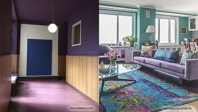
Purple-Violet
This is a colour that at first may seem hard to match, for its strenght, but it is not the case. Think that it is a tone that you can find easily in nature, where it matches perfectly with the surroundings, that way is much easier for us to find out how to combine it. Take in mind Lavender, it matches really well with nature tones, such as greens, other lilac tones and also greyish browns. A colour with a lot of vitality.
Emerald Green
A colour that will fill our home with elegance, a serious tone that reminds us of luxury but that depending on the pieces of furniture it is combined with, will change how it looks. We see it in the raw style, natural bright toned woods, as for example in dinner tables that brighten up our livingroom.
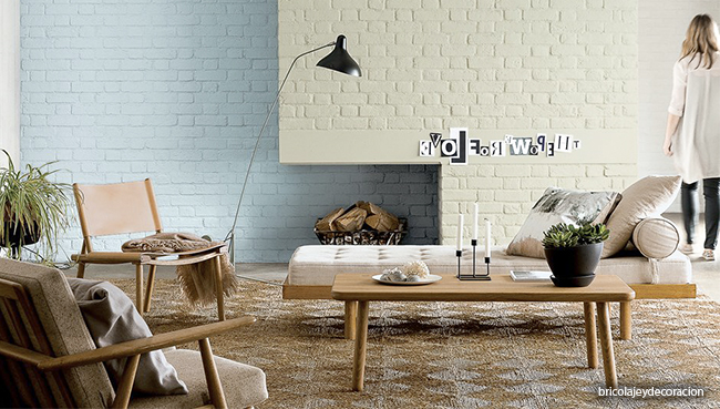
Neutral colours for Living Rooms
Even though previously mentioned colours are a trend, neutral colours such as greys, beiges, creams, etc…, are never “out”.
When we speak of neutral colours, we refer to decorative colours will a low saturation (greys) and that can be combined with wall paintings in the previous tones preventing oversaturating our home.
Grey: Can be used in all its tones, from pastels to darker tones. The livingroom is without question, the most common place in the entire house, also the one where we spend more time in. For that same reason, creating a warm environment is very important, and by using grey as a predominant colour we can achieve it, adding small details in another appealing tone as orange or mustard.
Beiges and Nudes: Colours like white, browns, beiges, greens and pastel blues always look good no matter the place. These are basic, easy to combine with a more intense colour or furniture.
Colour Combination for Living rooms
Orange and Bordeaux
With whites or very subtle nude tones you will get welcoming rooms with a touch of colour in their design. This colours can be used in pillows, lamps and table centres to give a little touch of colour without overcharging the room.
Pink
The combinations in soft pink tones along with several natural flowers, rattan objects or a piece of white furniture in a shabby style make your living room in a place that you will not want to leave.
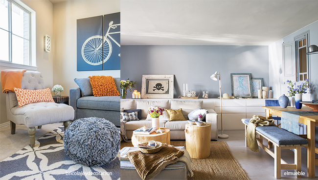
Blue
Perfect with whites and reds or with different tones of blue, as can be seen in the images bellow. A fresh and clean result. Stripped accessories that will transport us to pleasant summer days, and rattan boxes to finish the “Cote d’azur” design of our living room.
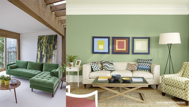
Green
Different tones of green go along perfectly with earth and violet tones…, and with furniture made of bright wood, that will illuminate your living room as never before. Add plants and accessories made of natural materials such as rattan.
Lilac and Purple
These tones combine perfectly with greens and browns allowing us to create spaces filled with energy.
Yellow
Yellow is one of those colours that simply illuminate your living room. Great looking when combined with white, green, grey and black. You can combine it with almost all soft colours.
Do not be afraid! It is time for your livingroom to shine as never before.